Quickteller

UX Case Study: Quickteller Dashboard Redesign

A payment platform for quick domestic and international funds transfer.


  • Platform: Desktop and Mobile (client/app)
  • Client: Quickteller
  • Industry: Finance
  • Live: No
  • Design team: 1 persons
  • My role: Lead designer

Project Overview

Quickteller, a leading payment platform, initiated a redesign to improve the dashboard's user experience, focusing on streamlined payments and enhanced accessibility.

Streamlined payment options require streamlined management options.

Project Goals

  1. Optimize Dashboard: Redesign for clarity and efficiency.
  2. Enhance Payments: Improve the user journey.
  3. Business Integration: Seamless services inclusion.
Goals: To optimize the UI, enhance user journey, and provide seamless services to users.

Research Phase

Conducted user interviews, surveys, and analyzed behavior to identify pain points and preferences.

I analysed data from the interviews and surveys to help inform design decisions.

Design and Prototyping

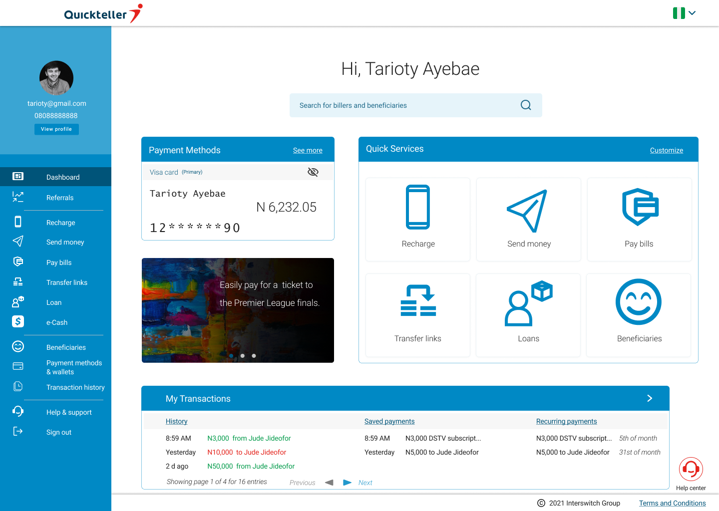
  1. Simplified Layout: Clean home page design.
  2. User-Centric Navigation: Easy access to key functions.
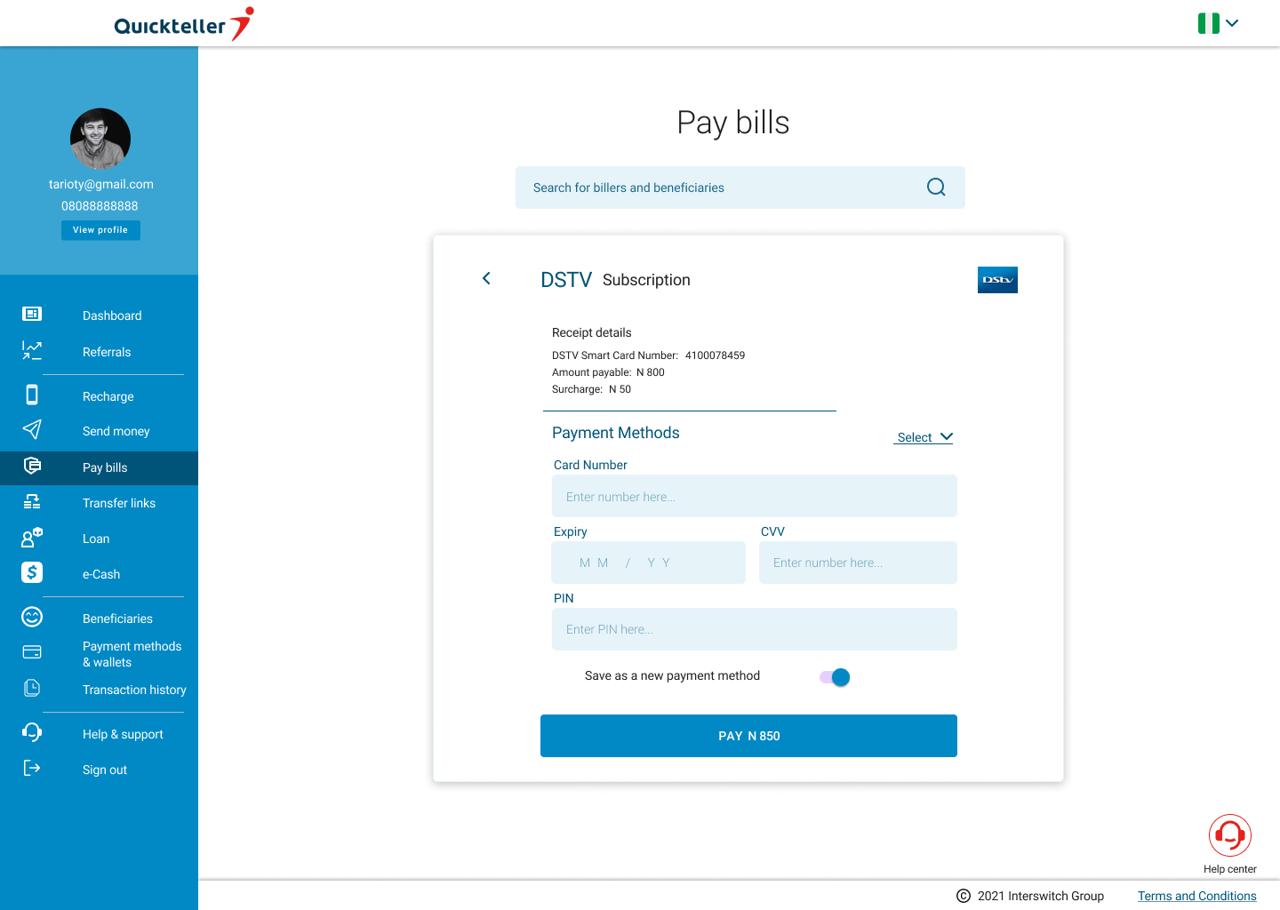
  3. Clear Call-to-Action: Optimized buttons for payments.
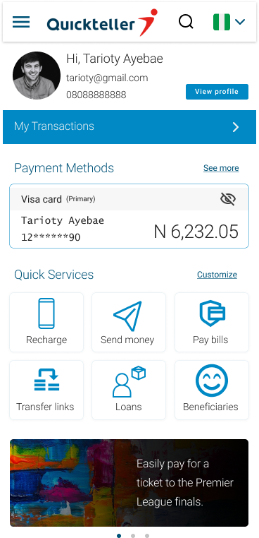
The final designs of the simplified and enhanced customer's dashboards

Development Phase

Collaborated for responsive implementation.

Testing and Iteration

Usability testing refined design iteratively.

Results

  1. Improved Engagement: Users spent more time.
  2. Streamlined Payments: Faster transactions.
  3. Enhanced Business Experience: Efficient financial management.
Improved efficiency, enhanced customer experience and reduced management costs.

Conclusion

Redesign achieved goals, ensuring user-friendly payments and business integration. Continuous feedback essential for ongoing improvement.

Discover Define Ideate Design

Connect with me